


 Blog PDF for offline reading
Quick answer: To get custom mugs with logo artwork that decorates cleanly, send an outlined vector file (AI, EPS or PDF). Name every color as a Pantone reference and expect glazed ceramic to shift it slightly. Size the logo to the decorator's mug template, not your letterhead, and keep strokes and small text above the method's minimum. Keep decoration out of the lip zone. Approve only a proof that states the decoration method, colors, placement relative to the handle, and dimensions in millimeters.
Most problems with custom mugs with logo branding start at the artwork stage, long before a mug reaches a kiln or a heat press. A brand team exports a PNG from a slide deck, approves a flat mockup in thirty seconds, and the mugs arrive in the wrong color with lines that have filled in. Sometimes the logo faces the wall when a right-handed person drinks. This guide is for the people who own the logo: marketing, brand and design teams preparing a file for ceramic decoration. It covers file requirements, Pantone matching on glazed surfaces, print-area and wrap placement, minimum line weights, and how to read a mug proof before you sign it.
Why logo files fail on ceramic (and why the proof is where you catch it)
The problem: A mug is curved, glossy, often tapered, and decorated with materials that behave nothing like office printer toner. Public complaints about personalized mugs follow a consistent pattern: images that print "dark and blurry," photos placed on the wrong sides, and red that looks faded straight out of the box. In several of those cases the seller blamed the customer's file or a "technical scaling" step.
The agitation: Schedules make it worse. In PPAI's 2025 research, 68.8% of the largest promotional distributors[1] said end buyers prioritize faster turnaround and rush delivery. Under that pressure the proof becomes a formality. Decorated ceramic is also permanent: once a decal is fired or a design is engraved into the glaze, nobody can reprint just the bad side.
The solution: Treat artwork prep as a short engineering step. You need one master vector file, a written color specification, a placement map based on the actual mug template, and a proof checklist. The rest of this article walks through each one.
What "print-ready" means for custom mugs with logo artwork
A print-ready mug file is a vector artwork with outlined type and named spot colors. It is drawn at 1:1 scale inside the decorator's template for that specific mug shape. Six terms come up on every proof, and it helps to know them before the first email:
- Vector: artwork built from paths (AI, EPS, PDF, SVG) that scales without pixelation. A PNG or JPG pasted inside a PDF is still raster.
- Spot color: a single named ink or ceramic color, usually referenced to a Pantone number, as opposed to a CMYK mix.
- Imprint area: the zone the decorator can physically reach on the mug body. It is always smaller than the mug's height and circumference.
- Wrap: a design that travels around the body, usually stopping short of the handle on both sides.
- Lip zone: the band below the rim that touches the drinker's mouth. Regulators test it separately (see Step 5).
- Proof: the decorator's drawing of your logo on the mug, with method, colors and dimensions. It is the document you are approving, not the mockup on a sales page.
Getting this right matters because ceramic mugs stay in use for years. In ASI's 2026 drinkware research, 87% of recipients said they keep promotional drinkware because it is useful[2]. A smudged logo gets seen at the same frequency as a sharp one.
Step 1: Build a master vector file
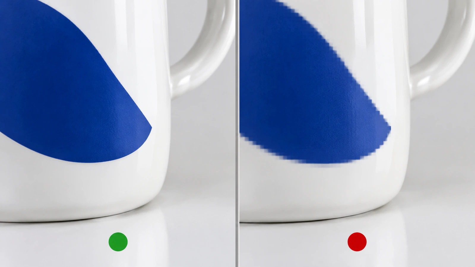
Start from the original brand vector, not an export. If the only version you have is a website PNG, have it redrawn first. Auto-tracing a small bitmap produces lumpy curves that a kiln-fired decal or a laser will reproduce faithfully.
- Outline all fonts. Convert type to paths so a missing font on the decorator's side cannot substitute a default typeface.
- Remove live effects. Drop shadows, glows, transparency and blend modes either rasterize on export or disappear. Flatten them into solid shapes, or delete them.
- Use one spot color per element. Each fill and stroke should carry a named swatch. Delete unused swatches so the separations match the color count you are paying for.
- Prepare three versions. Supply the full-color logo, a one-color version, and a reversed (knockout) version for dark glazes. Decorators often recommend the one-color version once they see your glaze choice, and having it ready saves a revision round.
- Convert strokes to fills after you have checked line weight (Step 4), so the weight does not change when the artwork is scaled.
- Name files clearly, for example
brand_logo_1c_PMS-XXXX_v3.pdf, and send a PDF/X file alongside the native AI or EPS.
Photographic or gradient artwork is the exception. If the design really needs a photo, send the highest-resolution original at the final print size. Expect only sublimation or full-color decals to reproduce it, and ask whether the decorator will rescale it. Silent rescaling is behind many of the "blurry photo" complaints in public reviews.
Step 2: Specify Pantone colors for glazed ceramic
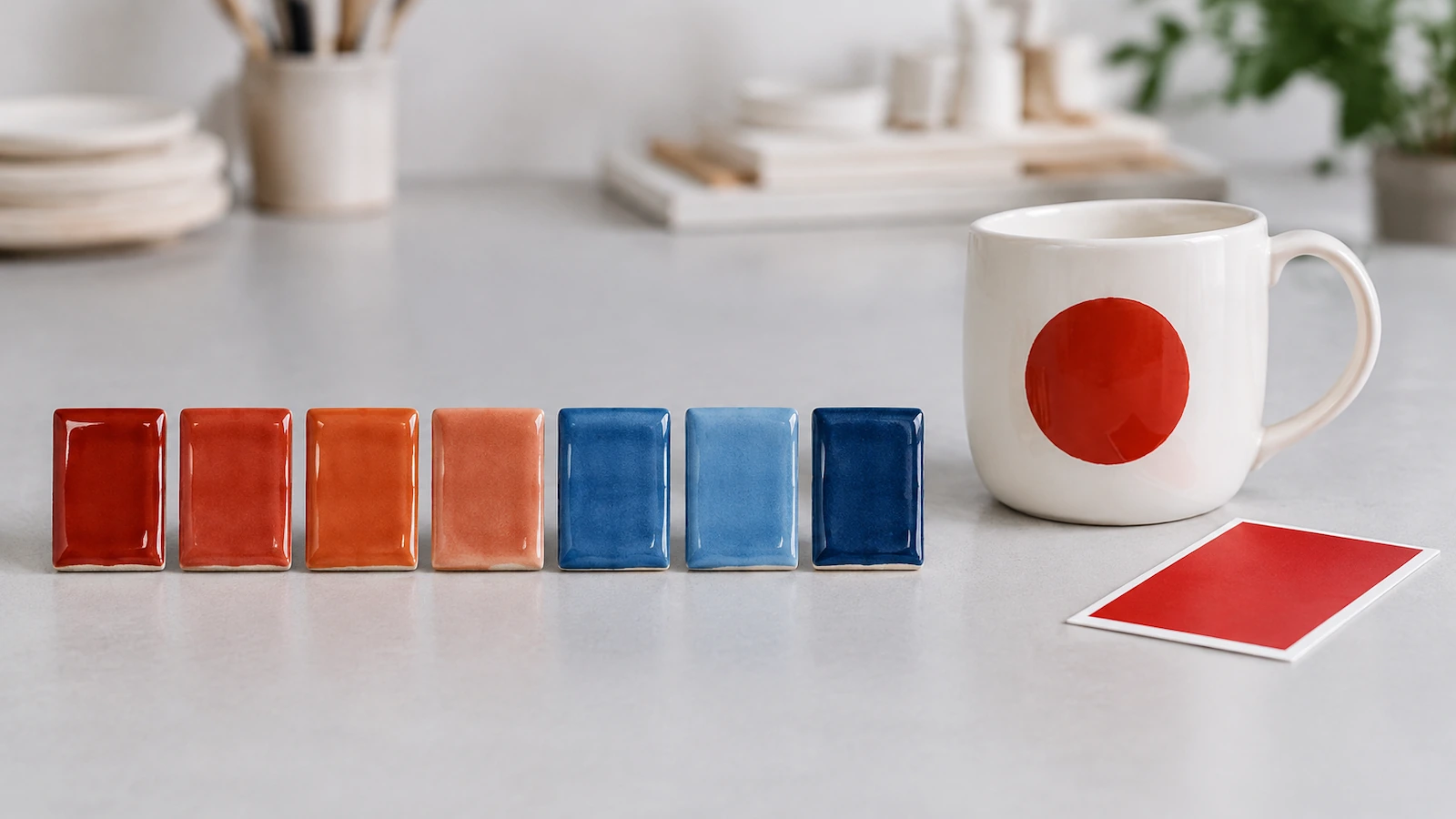
Pantone numbers were built for ink on paper. Ceramic decoration uses inorganic pigments that are fired into or onto glaze, and the result depends on the pigment family, the firing temperature, the glaze surface and the body color underneath. So treat the Pantone number as a target, not a promise.
- Quote the coated reference (for example "PMS XXXX C"), because a glossy glaze behaves more like coated stock than uncoated paper.
- Expect the biggest shifts in saturated reds, oranges and yellows. These colors historically relied on cadmium-based pigments. A 2025 study in the Journal of Hazardous Materials[3] linked red rim decoration with cadmium levels up to about 17,300 mg/kg. That is a color choice and a compliance question at the same time.
- Account for the body. A logo on bright white porcelain will look different from the same logo on speckled stoneware or a tinted glaze. White underbase layers can help on dark mugs, but they add a separation.
- Do not ask for a Pantone match on a reactive glaze. Reactive and handmade glazes vary from piece to piece by design. Specify the logo color, not the glaze color.
- Ask for a fired color tile or a physical sample for any color your brand guidelines protect strictly, and approve against that sample under daylight-balanced light, not on a monitor.
- Write the tolerance down. "Visually close under D50 light to the approved tile" is a usable acceptance criterion. "Exact Pantone match" is not achievable on fired ceramic and will only cause a dispute.
Step 3: Map the print area, wrap and handle side
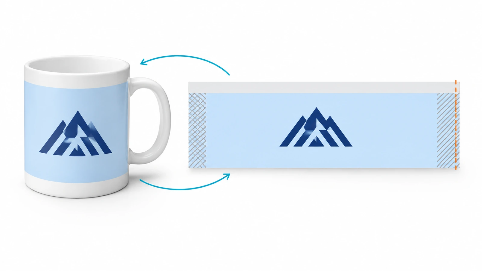
Always ask for the decorator's template for the exact mug model. Imprint areas vary with shape, handle position and method. A generic "mug template" from the internet will mislead you.
Do the wrap math
The usable wrap length is the circumference (π × diameter at the decoration height) minus the clearance the decorator needs on both sides of the handle. For a hypothetical 80 mm body, the circumference is about 251 mm. The handle gap and the method's reach then reduce that figure, which is why the template matters more than a ruler. If you plan a full wrap, decide where the seam falls. Most teams put it at the handle so it disappears in the hand.
Decide which side faces whom
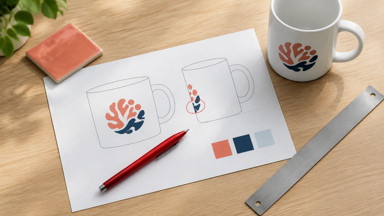
With the handle on the right, a right-handed drinker sees the left side of the mug while sipping, and people across the table see the right side. Decide deliberately: logo facing the drinker (a personal gift), facing outward (visible in meetings and on video calls), or both sides with a primary and secondary mark. Write the choice on the proof request as "handle right, logo on the side visible to the drinker," because "front" means different things to different people.
Watch tapered and curved bodies
Conical and belly-shaped mugs distort straight artwork. A rectangle placed on a tapered mug comes out as a curved band, and text can appear to tilt. Decorators fix this by arcing or warping the artwork in the template, so confirm they have done it and check the proof for leaning baselines.
Keep out of the lip zone
Leave a clear band below the rim unless your decorator can document that the decoration there passes lip-and-rim testing. Regulators treat this area separately, which Step 5 explains. Most brand logos look better slightly below center height anyway, where the eye naturally lands.
Step 4: Check minimum line weights and text size
Fine detail is where logos fail first. A thin stroke that looks elegant on a 27-inch monitor can fill in during screen printing, break up in a decal, or vanish under a glaze. Work in physical units: 1 point equals 0.3528 mm, so a 0.25 pt hairline is under a tenth of a millimeter.
- Ask each decorator for their minimum positive line, minimum reversed line, and minimum text height for the method you choose, and get the answer in writing. These numbers depend on mesh, decal stock, laser spot size or engraving depth, so no universal figure applies.
- Use about 0.5 pt (roughly 0.18 mm) as a planning floor while you design, then replace it with the decorator's own number. It is a starting point for review, not a specification.
- Give reversed lines extra weight. White lines knocked out of a solid color fill in sooner than dark lines on white, because the surrounding color spreads.
- Look for "danger details": registered-trademark symbols, taglines under the mark, thin serifs, fine outlines around letters, and tight gaps between letters or shapes. Gaps fill in just as lines do.
- Print the logo at 100% actual size on paper and wrap it around a real mug. If anything is hard to read at arm's length, simplify it or use the one-color secondary mark.
- Avoid halftones and gradients for spot-color methods. If your logo has a gradient, ask for a solid-color version, or choose a full-color process.
Step 5: Lock compliance details before approval
Artwork choices affect food-contact and product-safety obligations, so settle these before the proof is signed. Our product page covers how to verify test reports before you pay. The points below are the ones the artwork itself controls.
- Lip and rim. In the US, FDA's Compliance Policy Guide Sec. 545.450[4] sets the strictest lead action level, 0.5 µg/mL for any one of six units, for cups and mugs. Lip-and-rim decoration is assessed with its own test method. The international test method is ISO 6486-1:2019[5]. Keeping the logo below the rim removes a whole category of risk.
- Exterior decoration still counts. California has issued Proposition 65 notices for ceramic mugs with exterior designs containing lead, including notice 2024-05083[6], which ended in a settlement requiring reformulation or a warning. If your mugs will be sold or given away in California, ask how the exterior decoration is assessed.
- Metallics change the care label. Gold, platinum and other real-metal accents spark in microwaves. The CPSC recalled about 26,400 mugs in 2023[7] because metallic print was mislabeled as microwave safe. If your logo uses metallic ink, the proof and the base marking must say "not microwave safe."
- Be careful with claims printed on the mug. FDA guidance warns that using "Lead Free" on ceramicware that contains extractable lead[8] can make the product misbranded. Keep safety claims off the artwork unless test reports cover that exact glaze and decoration.
- Decorative-only pieces need permanent marking. If a piece looks like a mug but is not intended for drinking, 21 CFR 109.16[9] requires both a conspicuous label with letters at least 3.2 mm tall and a permanent statement on the base, such as "Not for Food Use. May Poison Food." That base marking is part of the artwork.
Step 6: Read the mug proof line by line
A proof is a contract drawing. Check it with a printed copy and a pen rather than a quick look on a phone. Confirm each of these before you write "approved":
- Mug model and glaze exactly as ordered, including body color and finish (gloss, matte, reactive).
- Decoration method named: screen print, kiln-fired decal, sublimation, laser or glaze engraving. The method determines care instructions, so "custom print" is not enough.
- Color callouts listing each Pantone reference and the number of colors you are being charged for.
- Imprint dimensions in millimeters (width and height), plus distance from the rim and from the base.
- Handle orientation drawn, with the logo side stated relative to the drinker.
- Second-side or wrap artwork shown in full, with the seam position marked.
- Artwork integrity: zoom to 400% on the PDF. Edges should be smooth paths, the tagline should be present, and the ® symbol should be legible and not filled in.
- Distortion on tapered bodies: baselines should look level on the rendered mug, not just on the flat art.
- Care and safety notes consistent with the method and any metallic content.
- Revision number and date, so production cannot run an earlier version.
If anything is missing, ask for a revised proof rather than approving "with changes." Verbal corrections are how two-sided designs end up swapped. When your team is ready to scope quantities and timelines, our custom ceramic mugs for corporate gifts, cafés and branded retail page explains the ordering steps, supply paths and quality checks, so you can plan the proof stage inside a realistic schedule.
How decoration methods change what your ceramic mugs with logo files need
The same logo needs different preparation depending on how it will be applied. Use this table to set expectations before you request a proof. Thresholds vary by decorator, so confirm the specifics with yours.
| Method | File to send | Color handling | Fine-detail tolerance | Wrap / placement | Check on the proof |
|---|---|---|---|---|---|
| Screen print (surface ink) | Vector, spot colors, no gradients | Pantone-referenced spot inks; promotional decorators commonly limit the number of colors | Moderate; thin reversed lines fill in first | Usually one or two fixed positions | Color count, ink coverage on curved areas, hand-wash vs dishwasher note |
| Kiln-fired ceramic decal | Vector for spot colors; high-resolution art for full color | Ceramic pigments fire to a shifted shade; ask for a fired tile | Good for clean marks; very fine hairlines can break | Partial or full wrap possible | Fired color target, rim clearance, metallic content |
| Sublimation (polymer-coated blank) | Full-color raster at final size, or vector | CMYK-style; dark photos print darker on the mug | Good for photos; depends on source resolution | Full wrap common | Image resolution, side assignment, coating care limits |
| Laser or etched marking | Single-color vector, solid fills | No ink; tone comes from the glaze or body | Depends on spot size; small text loses contrast | Limited by the machine's reach on curves | Contrast on your glaze, depth, minimum text height |
| Engraved or embossed medallion in glaze (handmade stoneware) | Simplified vector, bold shapes | Glaze pools in recesses; no Pantone match | Low; small counters and thin lines fill with glaze | Single medallion position | Simplified artwork approval, medallion size, piece-to-piece variation |
One pattern stands out: the more permanent the method, the simpler the artwork must be. Teams that want both durability and fine detail usually end up with two marks. A bold primary logo goes on the mug, and the detailed version stays on the packaging insert.
FAQ: preparing logo artwork for mug decoration
FAQ: Can I send a PNG or JPG of my logo?
For spot-color methods, no. Send an outlined vector file (AI, EPS, PDF or SVG). A raster logo has to be redrawn, which adds a revision round and can change your mark. Raster files only work for sublimation or full-color decals, and only at full resolution at the final print size.
FAQ: Why doesn't my Pantone color match exactly on custom coffee mugs logo orders?
Ceramic decoration uses fired inorganic pigments, not paper inks, and the glaze surface and body color change how the color reads. Use the Pantone Coated reference as a target, ask for a fired tile for critical colors, and agree a visual tolerance in writing. Reactive glazes cannot be matched to Pantone at all.
FAQ: What is a safe minimum line weight for a mug logo?
No universal number exists, because it depends on the method and the decorator's equipment. Ask for the minimum positive line, the minimum reversed line and the minimum text height in writing. While designing, about 0.5 pt (around 0.18 mm) is a reasonable floor to review against. Then use the decorator's figure.
FAQ: Which side of the mug should the logo go on?
With the handle on the right, a right-handed drinker sees the left side and onlookers see the right side. Choose based on purpose: a gift faces the drinker, while visibility in meetings faces outward. Many teams put the primary logo on one side and a secondary mark on the other. Always state the choice relative to the handle on the proof request.
FAQ: Can the logo go all the way up to the rim?
It is best to leave a clear band below the rim. Lip-and-rim decoration is assessed separately for lead and cadmium release, and US guidance applies its strictest action levels to cups and mugs. Keeping the design lower avoids that risk and usually looks better.
FAQ: Can I add metallic gold to my logo?
You can, but real-metal decoration makes the mug unsafe for microwaves, and the care marking must say so. Mislabeling metallic mugs as microwave safe has triggered CPSC recalls. If the mug needs to be microwaveable, use a non-metallic gold-toned color instead.
Key takeaways
- Rush schedules are why proofs get skimmed, so build a checklist before you need it. — 68.8% of top distributors report buyers prioritizing faster turnaround (Source)
- Mugs get kept, so artwork quality is seen for years. — 87% keep promotional drinkware because it is useful (Source)
- Keep the logo out of the lip zone; mugs face the strictest lead limit. — 0.5 µg/mL action level for cups and mugs (Source)
- Metallic logo accents require a "not microwave safe" marking. — about 26,400 mislabeled metallic mugs recalled in 2023 (Source)
- Decorative-only pieces need warning text built into the base artwork. — letters at least 3.2 mm tall on the required label (Source)
- Drinkware is a core branded-merchandise category, so decorators are used to detailed specs. — 10.2% of US promotional distributor sales in 2024 (Source)
Conclusion
Good custom mugs with logo branding come from treating the file as a production specification rather than a marketing asset. Send outlined vectors with named spot colors and a one-color fallback. Set a written color tolerance for fired ceramic, and place the logo using the real template and a stated handle orientation. Check line weights in millimeters against the decorator's minimums, and keep compliance details on the artwork itself. Then read the proof as the contract it is. When the artwork is ready and you want to talk quantities, timing and decoration options, start with our custom ceramic mug program and request a quote.
References
- PPAI Research, "Distributors Balancing Speed and Creativity for End Buyer Priorities," October 2025. ppai.org ↩
- ASI, "ASI's 2026 Ad Impressions Study: Drinkware," June 2026. asicentral.com ↩
- Journal of Hazardous Materials (2025), study of lead and cadmium migration from ceramic mug interiors and exteriors. sciencedirect.com ↩
- U.S. FDA, Compliance Policy Guide Sec. 545.450, "Pottery (Ceramics); Import and Domestic – Lead Contamination," November 2005. fda.gov ↩
- ISO 6486-1:2019, "Ceramic ware, glass ceramic ware and glass dinnerware in contact with food — Release of lead and cadmium — Part 1: Test method." iso.org ↩
- California Office of the Attorney General, Proposition 65 60-Day Notice 2024-05083 (ceramic mugs with exterior designs, lead). oag.ca.gov ↩
- U.S. Consumer Product Safety Commission, "Boost The Mood Ceramic Mugs Recalled Due to Fire Hazard," June 2023. cpsc.gov ↩
- U.S. FDA, "Guidance for Industry: The Safety of Imported Traditional Pottery Intended for Use with Food and the Use of the Term 'Lead Free'," November 2010. fda.gov ↩
- Electronic Code of Federal Regulations, 21 CFR 109.16, "Ornamental and decorative ceramicware." ecfr.gov ↩





The information below is required for social login
Sign In
Create New Account