


 Blog PDF for offline reading
Quick answer: Custom design tote bags print cleanly when four decisions are made before anyone talks about quantity. First, place the artwork inside the bag's real printable zone, away from seams and handle stitching. Second, count ink colors against the bag color, because dark bags usually need a white underbase. Third, match Pantone spot colors on the actual fabric color, not on paper. Fourth, deliver separated, scale-accurate files: vector for screen print, 300 dpi raster for digital transfer. Get these right and you remove the most common causes of speckled, invisible, or off-brand prints.
This guide is for brand and marketing teams at the design stage, after you have decided you want a custom bag with a logo and before you approve a proof. It covers placement, print-area sizing, ink-versus-bag contrast, color matching on colored canvas, and file prep. If you still need to choose fabric, construction, or a supplier model, start with our guide to specifying, printing, and inspecting custom canvas tote bags, then come back here for the artwork.
Why good logos turn into bad totes
The failure usually shows up at unboxing. A logo that looked crisp on a monitor arrives speckled because ink sank into the canvas weave. Or a dark-navy mark nearly disappears on a forest-green bag. Or a thin tagline has filled in until it can't be read. None of these are fabric defects. They are design decisions that nobody made on purpose.
The cost is not the print bill. It is whether anyone carries the bag. In a Custom Ink survey reported by ASI, 67% of more than 1,000 corporate end-buyers said they judge a campaign by whether recipients voluntarily use the item, and 45% ranked longevity as the most important feature (ASI coverage of the 2026 end-buyer survey[1]). ASI's own research found that 78% of U.S. consumers keep promotional items because they are useful (ASI 2026 impressions release[2]). A bag people are embarrassed to carry generates no impressions, however cheap it was. One recipient's public verdict on yet another commemorative office tote was "cute but try gifting something useful next time."
The fix is a short, repeatable design process. It treats the bag as a moving, folding, textured surface rather than a flat artboard.
What "custom design" means for a tote
In this guide, the custom design is the artwork system applied to the bag. That system has four parts: where the mark sits, how big it is, which colors it uses relative to the fabric, and the production files that tell the printer exactly what to do. It is separate from construction, meaning fabric weight, gussets, and handles. Construction is covered on the custom canvas tote bags page.
The distinction matters because the two interact in one direction only. Construction limits what the artwork can do: a gusseted bag has a smaller flat front panel, and an open weave swallows fine detail. Artwork cannot fix construction. So read your bag spec first and design to it.
Personalization is also part of design now. One heritage canvas tote's sales rose 75% in the first half of 2025 against the same period a year earlier, and executives in the category told CNBC that "personalization is a huge part of [the trend]" (CNBC, July 2025[3]). For brand teams, that is an argument for a clean primary mark with room for a name, team, or event line. It is not an argument for a crowded panel.
How to plan custom design tote bags that print cleanly: 6 steps
Step 1: Place the artwork where the bag is actually seen
Start with how the bag is carried, not with the logo file. On the shoulder, the top band of the front panel folds inward under load and the bottom third disappears against the hip or into a gusset fold. The zone that stays flat and visible is the upper-middle of the panel, a little above the true center. Your primary mark belongs there.
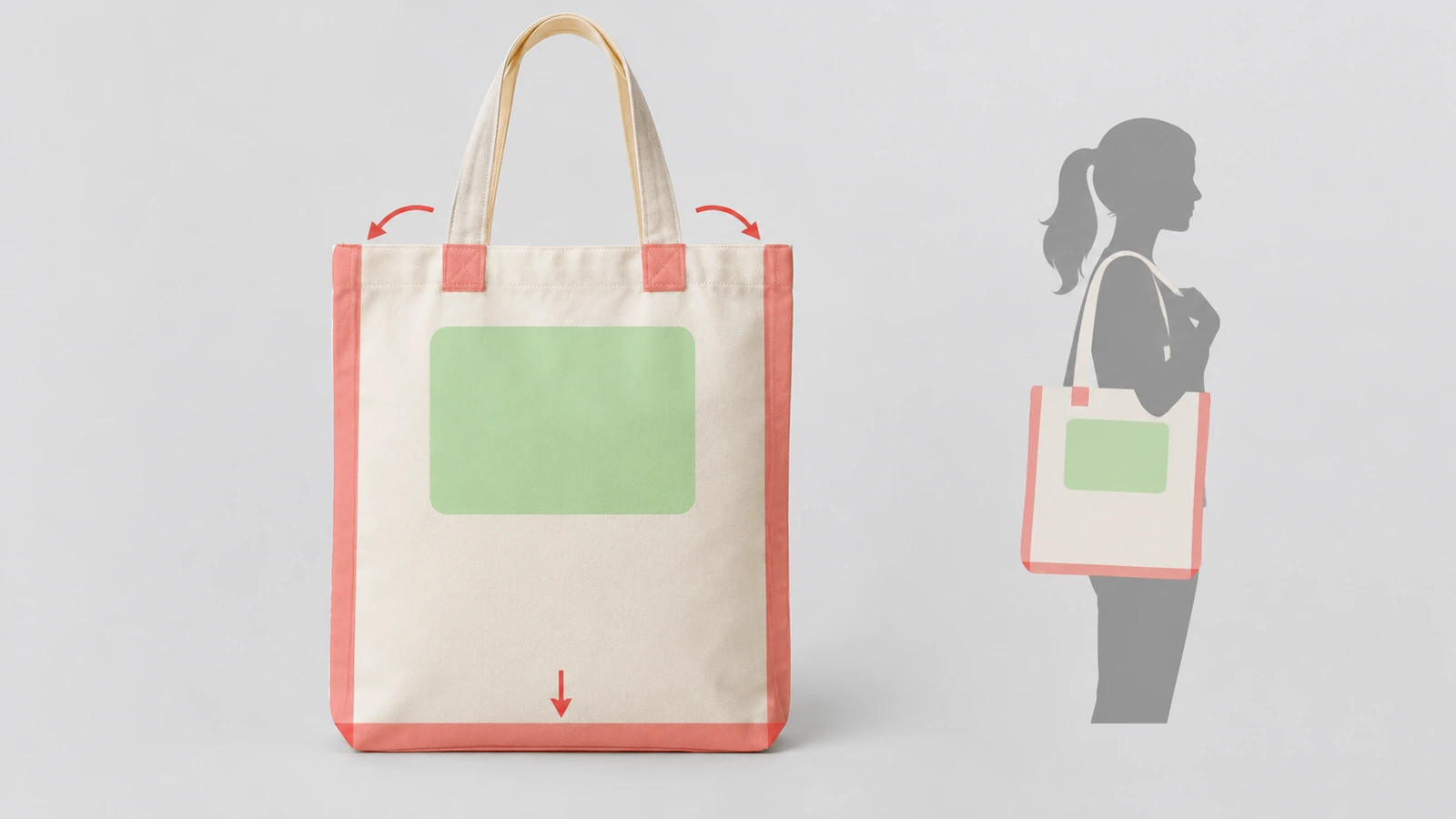
Then mark the no-go zones on your template:
- Side and bottom seams. Screens and transfer platens cannot sit flat over a seam, so ink skips or ghosts there.
- Handle attachment points. Reinforcement stitching creates ridges that break solid fills.
- Gusset folds. On a gusseted bag, artwork that runs into the fold ends up split across two planes.
Ask the supplier for a printable-area template at 1:1 scale and their placement tolerance in writing. Some factories quote around ±0.5 cm. Then design so that drift in any direction still clears every seam. This one step prevents the "crooked logo" complaint that shows up repeatedly in public reviews of branded totes.
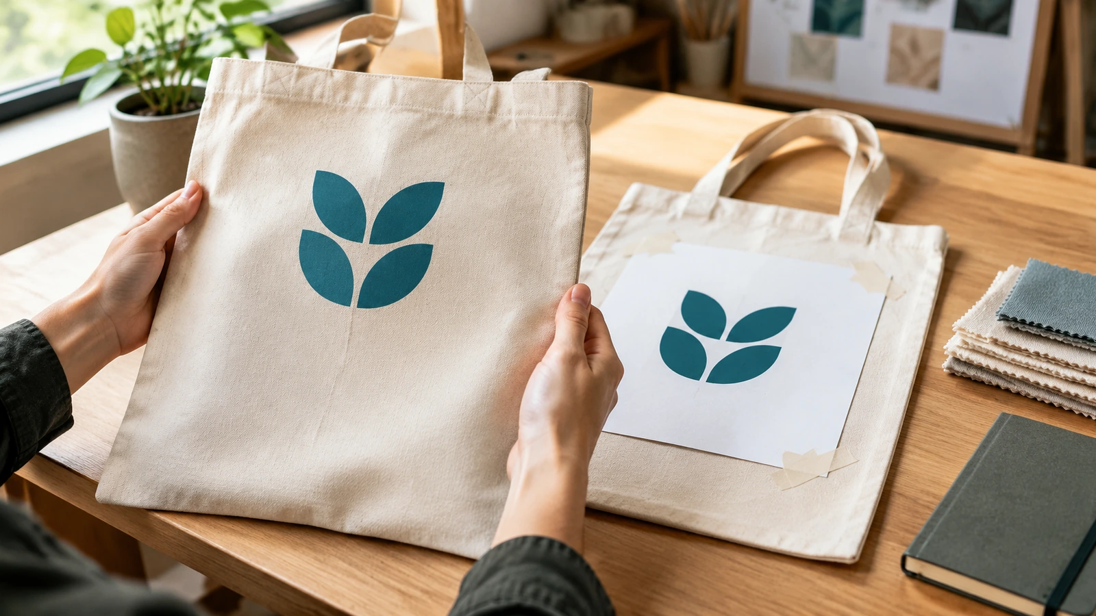
Sizing check: print the artwork at full size on paper, tape it to a blank bag of the same model, hang the bag on a shoulder, and look at it from about 3 meters away. If the brand name isn't readable at that distance, enlarge it or drop the secondary text. A mark that fills only part of the safe zone usually looks more deliberate than one stretched edge to edge, and it leaves margin for the placement tolerance.
Step 2: Count ink colors against the bag color, not against white
Designers count colors on a white artboard. Printers count screens on the real fabric. Those two numbers are often different.
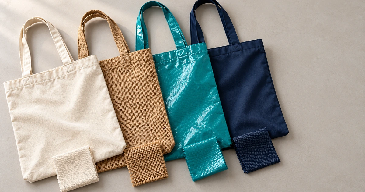
- Natural or cream canvas. Inks print slightly warmer and less saturated than on white paper, and pale colors such as light yellow, pastels, and light gray lose contrast fast.
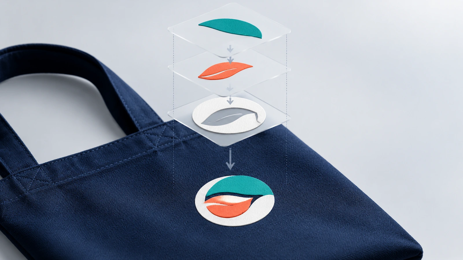
- Dark bags (navy, black, forest, burgundy). Most colored inks need a white underbase to stay bright. That base is an extra screen. A two-color logo on navy is therefore usually a three-screen job, and the extra ink layer makes the print feel heavier.
- Mid-tone bags (red, royal blue, olive). These are the hardest for contrast. Many brand palettes fall too close in value to the bag.
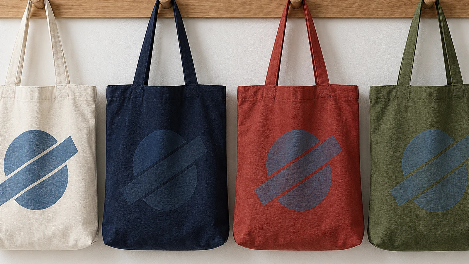
A quick contrast test needs no special software. Desaturate both the bag-color swatch and each ink swatch to grayscale. If they collapse into similar grays, the mark will vanish at a distance, whatever the hues look like in color. For custom color tote bags, the safest systems are usually a one-color knockout, where the bag fabric becomes the second "color," or a light ink on a dark bag with high value contrast.
Screen printing is generally most economical at 1–4 spot colors, because each color typically needs its own screen and setup. Past about four spot colors, many printers will recommend switching to a digital transfer method or simplifying the art. If your logo has gradients, check with your printer whether a solid-color version should be the default for bags. Fine halftone dots tend to break up on a coarse canvas weave. For guidance on which decoration method fits your quantity and fabric, see the decoration comparison on our canvas tote page; the rest of this guide stays on artwork.
Step 3: Match Pantone spot colors on the actual fabric
Pantone references are defined on paper stock. Canvas changes them in two ways. Ink absorbs into the fibers, and on any non-white bag the fabric color shows through and tints the ink. A brand red specified as a PMS spot color can come out brick-colored on natural canvas and muddy on tan if nobody tested it.
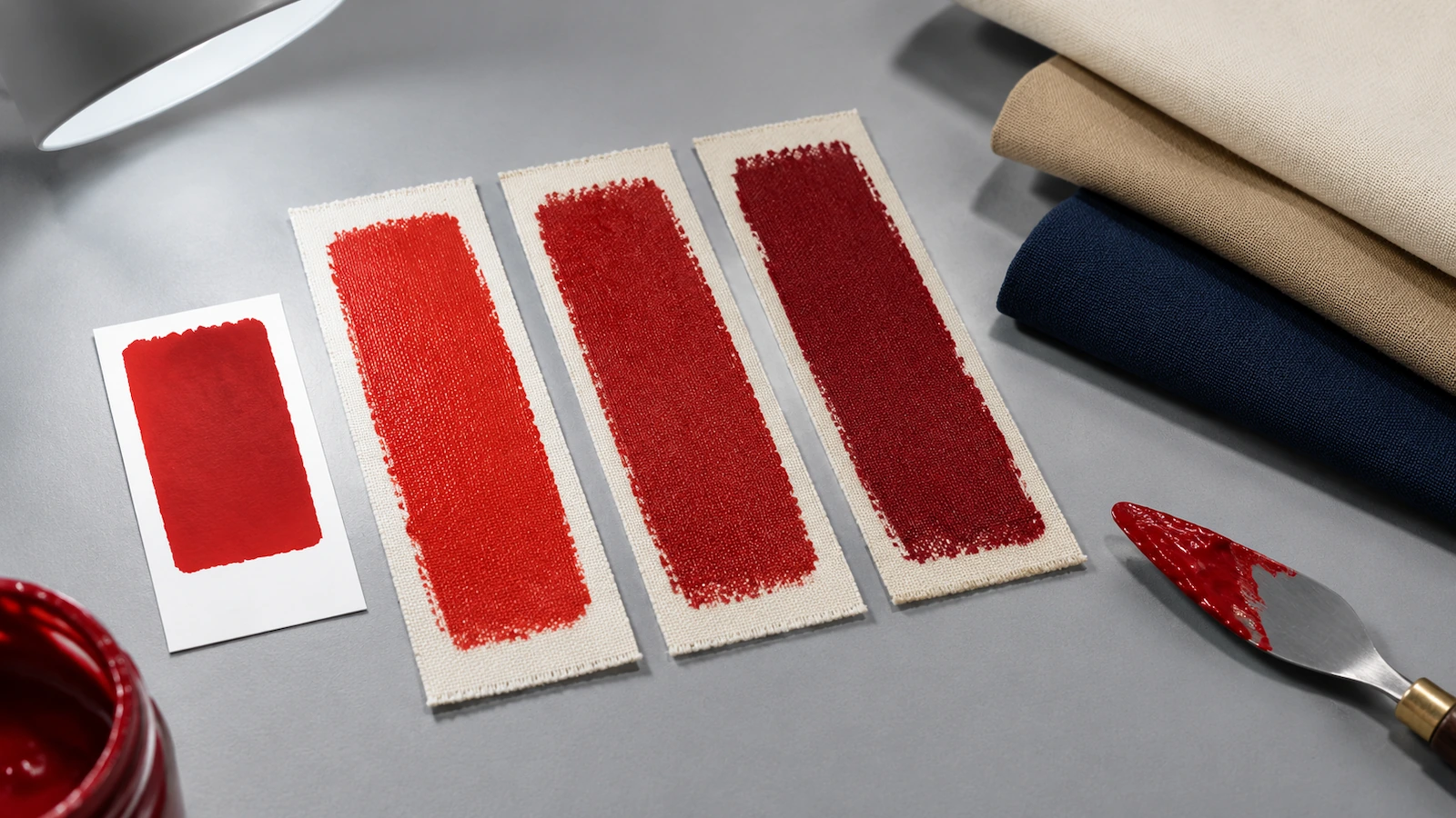
A workable color-matching protocol:
- Specify spot colors by PMS reference in the file and in writing. "Our brand red" is not a specification.
- Request a strike-off on the real bag color, meaning a physical ink sample on that fabric. A digital proof confirms placement but tells you nothing reliable about printed color.
- Judge under neutral daylight. Factories commonly compare samples under D65 standard illuminant lighting. Office LEDs and screens will mislead you.
- Agree a tolerance. Some factories write color difference limits such as ΔE ≤ 2.0 into their acceptance criteria. Whatever number you use, put it in the purchase order rather than relying on "close enough."
- Treat bag color as a separate match. Dyeing the fabric itself to a brand color is a different request from matching ink, and dyed fabric varies between dye lots. Ask for a fabric swatch from the production lot.
- Archive everything for reorders: approved strike-off photo, ink references, and screen or transfer files. Reorders without these drift in color.
Durability is a design input too. Supplier-reported figures vary widely: water-based screen inks claimed to survive 50+ wash cycles, and some direct-to-garment prints rated at roughly 15–25 washes. If the bag will be laundered, ask for wash-fastness results. A common method is AATCC TM61 with a grey-scale rating, and some buyers set grade 3 or better as a minimum. Don't infer durability from a photo.
Step 4: Build files the printer can use without guessing
Artwork that isn't print-ready is one of the most frequently cited causes of production delay: low-resolution logos, missing color separations, and proofs waiting for approval from several people. A clean file package removes those rounds.
| Decoration route | File format | Must include | Common rejection reason |
|---|---|---|---|
| Screen print | Vector AI, EPS, or PDF | Fonts converted to outlines; one layer per spot color, named with its PMS reference; underbase noted for dark bags | Embedded JPEG "vector"; live fonts; unnamed colors |
| DTF / DTG (digital) | PNG at 300 dpi at final print size | Transparent background; artwork cropped to the true print size; embedded color profile if your team uses one | Screenshot or web logo enlarged; white box behind the art |
| Embroidery | Vector source, which the supplier converts to a stitch file ("digitizing") | Simplified version without hairlines or tiny text; thread color references | Fine text that fills in; large dense fills that stiffen light fabric |
Two additions save the most time. First, a placement mockup: a flat drawing of the bag with the artwork in position and its distances from the top seam and center line. It shows positions only, with no extra creative. Second, a single approver named in the brief, so the proof isn't passed around a committee. If a sales or event team needs to weigh in, collect their input before the brief goes out, not after the proof comes back.
Step 5: Proof on a real bag and design for shrinkage
Approving only on screen is one of the most common tote printing mistakes suppliers list. Ask for a physical pre-production sample and check it against your brief: placement, size, color under daylight, edge sharpness on the weave, and how the print sits when the bag is loaded and folded.
Then account for cotton movement. Supplier guidance puts first-wash shrinkage of non-preshrunk cotton canvas at roughly 5–8%. On a 30 cm print zone, that is up to about 2.4 cm, enough to pull a centered mark visibly off position or wrinkle a large solid fill. Either specify pre-shrunk fabric in the brief or wash one sample and re-check the artwork. Include a care line with the bag (cold wash inside out, air dry, no iron on the print) so recipients don't ruin the print in their first laundry load.
Step 6: Check every claim your artwork makes
Anything printed on the bag is a public claim from your brand. Ordinary tote bags are generally outside the FTC's mandatory textile fiber labeling rules. But once you volunteer a fiber claim such as "100% cotton," "organic," or "recycled," it must be truthful and not misleading (FTC labeling guidance[4]). Before you print an eco message, check that a certificate exists and what it covers:
- Organic fiber claims normally trace to GOTS[5] certification with transaction certificates.
- A harmful-substance certificate such as OEKO-TEX STANDARD 100[6] covers tested materials, including prints and accessories listed on the certificate. It is not an organic claim. Read the certificate's scope, not the supplier's summary.
- If the design targets children, such as a school-giveaway character print, the product may be a children's product under CPSIA. Accessible parts are then limited to 100 ppm total lead and need third-party testing (CPSC[7]).
- If you are thinking about water- or stain-repellent finishes for California distribution, AB 1817 bars regulated PFAS in textile articles. The threshold is 100 ppm total organic fluorine from January 1, 2025, falling to 50 ppm from January 1, 2027 (California AB 1817[8]).
Claims matter commercially, not just legally. In ASI's 2026 bag research, 86% of consumers said a sustainable bag would give them an even more favorable view of the advertiser. That makes a verifiable claim worth printing and an unverifiable one a reputational risk (ASI 2026 Ad Impressions Study: Bags[9]).
Artwork strategies compared
Most brand marks fit one of five strategies. Choose by how the bag will be seen and how many screens or steps each strategy needs on your bag color, not by which version of the logo is most complete.
| Strategy | Typical colors / screens | On light bags | On dark bags | Best use | Main design risk |
|---|---|---|---|---|---|
| One-color knockout (bag shows through the mark) | 1 | Strong with dark ink | Strong with white or light ink | Events, high-volume giveaways, minimalist brands | Loss of detail if the original logo depends on outlines |
| 2–4 spot colors | 2–4, plus underbase on dark bags | Good; watch pale tints | Needs a white base, so the ink layer is heavier | Full brand-palette marks, retail bags | Mid-tone colors with low contrast against the bag |
| Full-color image or illustration | Digital process (no per-color screens) | Best on white or natural | Usually needs a white layer; check the feel | Photo totes, artist collaborations, small runs | Low-resolution source files; reduced wash life on some methods |
| Tone-on-tone (ink close to bag color) | 1 | Subtle | Subtle | Premium "quiet" branding, staff gifts | Invisible at distance; fails the grayscale test by design |
| Small embroidered mark or monogram | Thread colors, priced by stitch count | Good | Good | Gifts, personalization, executive kits | Fine text fills in; dense fills stiffen thinner fabric |
Two patterns come up repeatedly in creator and buyer discussions. Simple names, monograms, and clean marks sell and get carried more often than busy graphics. And heavier, flatter canvas reproduces solid ink and stitching more crisply than thin, open-weave fabric. If your design leans toward detailed illustration, confirm the fabric can hold it before committing.
FAQ
FAQ: What file format do I need for a custom bag with a logo?
For screen printing, send vector AI, EPS, or PDF with fonts outlined and each spot color on its own named layer. For DTF or DTG, send a PNG at 300 dpi at the final print size with a transparent background. For embroidery, send vector source art; the supplier converts it to a stitch file. Include a placement mockup showing distances from the top seam and center line in every case.
FAQ: How many ink colors should a tote design use?
As few as the brand can carry. Screen printing is usually most efficient at 1–4 spot colors, and on dark bags a white underbase typically adds one more screen. A one-color knockout is often the most legible option at a distance. For a cost comparison by color count on your bag, request a quote with your artwork attached.
FAQ: Can Pantone colors be matched exactly on colored canvas?
Closely, not identically. Canvas absorbs ink and the fabric color tints it, so a paper-based Pantone reference will shift. Specify the PMS spot color, approve a physical strike-off on the real bag color under D65 daylight, and write an agreed color tolerance into the order.
FAQ: Where should the logo go on a tote bag?
In the upper-middle of the front panel, slightly above center, clear of side seams, handle stitching, and gusset folds. That area stays flat and visible when the bag is carried loaded on the shoulder. Ask for the supplier's printable-area template and placement tolerance, and design so normal drift never touches a seam.
FAQ: Will the print shrink or distort after washing?
It can. Supplier guidance puts first-wash shrinkage of non-preshrunk cotton canvas at roughly 5–8%, which can shift a centered mark or wrinkle a large solid fill. Specify pre-shrunk fabric or wash-test a sample, and give recipients care instructions: cold wash inside out, air dry, no iron directly on the print.
FAQ: Can we print "organic" or "recycled" on the bag?
Only if you can back it up. Ordinary totes are generally exempt from FTC mandatory fiber labeling, but voluntary fiber claims must be truthful. Organic claims normally rely on GOTS certification, and recycled claims on a recycled-content standard with transaction certificates. Check what each certificate actually covers before the claim goes into the artwork.
Key takeaways
- Design for voluntary use, because that is how buyers measure success. — 67% of 1,000+ corporate end-buyers judge campaigns by whether recipients choose to use the item (Source)
- A bag that gets carried is one of the cheapest impressions in branded merchandise. — nearly 5,000 lifetime impressions, about 1/10 of a cent each (Source)
- Durability is the value signal buyers trust most, so wash-fast prints are a design requirement. — 70.4% named durability the strongest signal of product value (Source)
- Sustainability claims on bags draw scrutiny because bags draw the most sustainability demand. — bags led categories for sustainability interest at 21.6% (Source)
- Kids'-themed artwork can change the compliance category of the bag. — 100 ppm total lead limit for children's products (Source)
- Finishes sold in California must be PFAS-compliant, and the limit tightens soon. — 100 ppm total organic fluorine now, 50 ppm from January 1, 2027 (Source)
- The channel is large enough that design quality, not novelty, is what differentiates. — U.S. promotional distributor sales reached $27.1 billion in 2025 (Source)
Channel figures come from the PPAI 2025 sales volume estimate[10] and value-signal figures from PPAI Research[11].
Conclusion
Good tote artwork comes from treating the bag as a folding, textured, colored surface rather than an artboard. Place the mark where it stays visible when the bag is loaded. Count screens on the real bag color. Match spot colors on real fabric under daylight. Hand over files that leave the printer nothing to guess. Proof physically, design for shrinkage, and print only the claims you can certify.
When your artwork brief is ready, take it to our custom canvas tote bags page to pair it with the right fabric, construction, and inspection plan, and send the files with your quote request for a placement and color review.
Sources
- ASI: Survey shows corporate end-buyers prioritize high-end, stylish promo (January 2026) ↩
- ASI press release: Promotional products deliver impressions at a fraction of a cent (April 2026) ↩
- CNBC: This $40 bag is having its most popular summer ever (July 17, 2025) ↩
- U.S. Federal Trade Commission: Threading Your Way Through the Labeling Requirements Under the Textile and Wool Acts ↩
- Global Organic Textile Standard (GOTS), Global Standard gGmbH ↩
- OEKO-TEX: STANDARD 100 standard document ↩
- U.S. Consumer Product Safety Commission: Total Lead Content ↩
- California Legislative Information: AB 1817, Safer Clothes and Textiles Act ↩
- ASI: 2026 Ad Impressions Study: Bags (June 2026) ↩
- PPAI: Sales Volume Estimate, promo reaches new height (2026) ↩
- PPAI Research: New Year, New(ish) Trends ↩





The information below is required for social login
Sign In
Create New Account