We use cookies to enable our websites to remember information, to help some website functionalities to work properly, to understand how you interact with and use our websites and to display you content and ads that are relevant and engaging for you.
By clicking Accept All you consent to the use of these cookie.
The store will not work correctly when cookies are disabled.
Quick answer: Custom poly mailers with logo work best when the mark sits in the upper half of the front panel, clear of the shipping-label zone. Size it to read from across a room, print it in high-contrast ink on an opaque film, and repeat it on the same anchor point across every mailer size.
Why a Good Logo Can Still Disappear on a Mailer
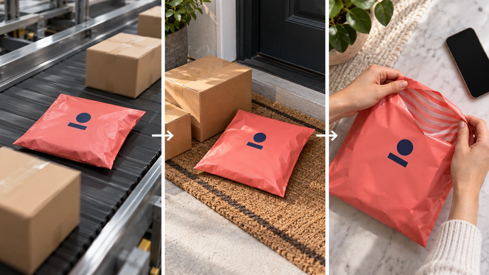
Most logo decisions for custom poly mailers with logo are made on a flat screen mockup at 100% zoom. The real package is seen in three places that look nothing like that mockup: a conveyor in a sorting hub, a pile of parcels on a porch, and a phone photo taken by the customer. A mark that looks balanced on screen can end up under a thermal label. It can turn grey on a pastel film, or blur into a smudge once the fine linework hits soft polyethylene. One buyer review of a digitally printed mailer complained that every small circular logo on the bag came out out of focus. That is a design problem, not a printing accident.
The cost of getting it wrong is higher than the bag price suggests. The National Retail Federation estimates that 19.3% of online sales will be returned in 2025[1]. For many apparel brands, that means the package makes a second trip and the customer handles the mailer twice. The same release reports that 71% of shoppers are less likely to buy again after a poor experience, up from 67% in 2024. The underlying study surveyed 2,006 online returners and 358 large US retailers[2]. Supply chain researcher Simone Peinkofer of Michigan State University has estimated that an average return costs about 60% of the item's cost[3]. Packaging that confuses people at any of these touchpoints adds friction to an already expensive process.
The fix is to design the mailer as a physical object with zones, viewing distances and a family of sizes, not as a flat logo canvas. The rest of this guide walks through that process.
What Makes Custom Poly Mailers with Logo Recognizable?
A branded mailer is recognized through three signals, roughly in this order: the color of the film, the position of a large shape, and only then the details of the logo itself. At a distance, people identify a package by color and layout long before they can read a wordmark. This is why brands with a consistent film color and a consistent logo position are recognized faster than brands with an intricate mark printed in a different spot on every bag.
Each of the three viewing moments rewards a different signal:
In transit, handlers and sorting systems see the mailer for a moment, often at an angle and partly covered by other parcels. Only a bold color field and a large, simple mark survive this.
At the doorstep, the customer sees the package from a standing position, usually among other deliveries. Brand color plus a mark in the upper half of the front panel does most of the work.
At unboxing, the viewer is close, and the phone camera is closer. Fine details, inside printing, secondary patterns and the way the bag opens become visible and shareable.
The NRF's Katherine Cullen made the commercial case in the same 2025 release: "Returns are no longer the end point of a transaction. They provide an opportunity for retailers to create a positive experience for customers and can translate to brand loyalty." For poly mailer designs, that means the exterior has to work for a stranger at a distance and for the customer up close, sometimes twice.
How to Place, Size and Color a Logo on a Poly Mailer
Step 1: Map the zones before placing anything
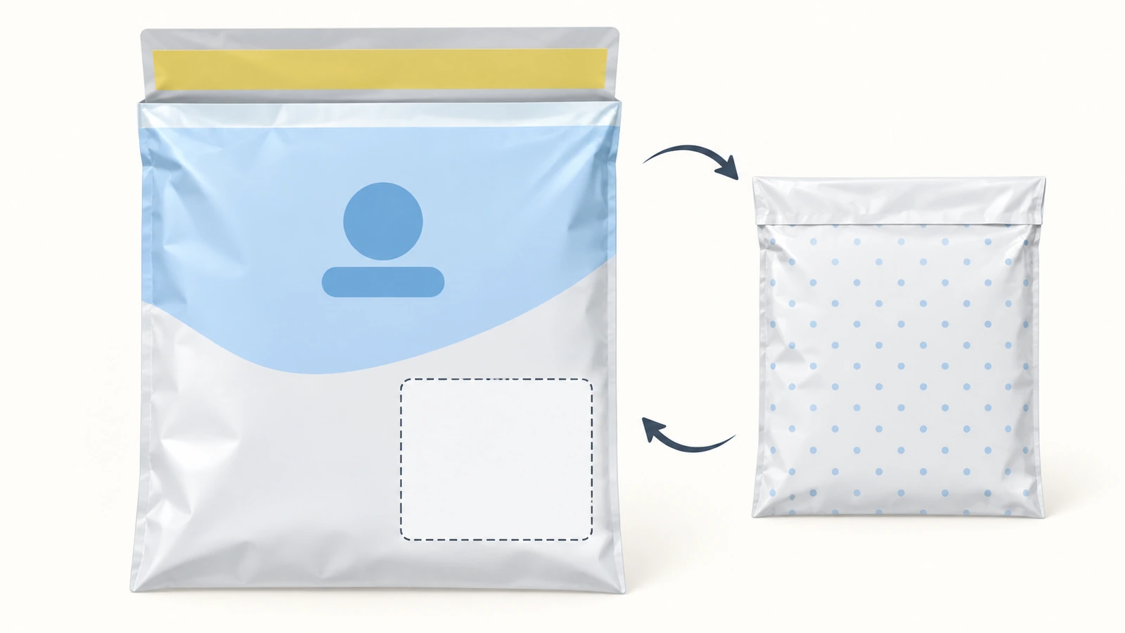
Start with a blank front and back panel and block out four zones before the logo goes anywhere:
Label zone: a flat, light, unprinted rectangle where packers apply the carrier label. Size it to your largest label plus a margin for crooked application.
Logo zone: the upper half of the front, away from the label zone. This is where the eye lands first when the bag lies flat.
Seal and flap zone: the adhesive area and fold line. Avoid putting critical artwork here, because folding and pressing distort it.
Back panel: secondary branding, a repeat pattern, social handles or care messages.
Step 2: Size for the farthest viewer, add detail for the closest
The primary mark should be readable from the doorstep, not just at arm's length. A practical starting point is to let the primary mark span roughly 40–60% of the front panel width on your most common size. Below about a third of the width, the logo tends to read as a sticker. Above about two thirds, it collides with the label zone. Treat these numbers as heuristics to check on a printed proof, not fixed rules.
Then strip detail out of the large version. Thin outlines, small taglines inside the mark and tight gradients are the first elements to fill in or blur on polyethylene film. Ask your printer for their minimum line weight and minimum reversed-out type size on film, and design comfortably above both. Keep the detailed version of the logo for the close-up surfaces: the back panel, the inside print, or the flap seen during opening.
Step 3: Treat film color and ink color as one decision
Polyethylene is a semi-translucent substrate, so the film color changes how every ink looks. One verified buyer of a light-blue stock mailer noted that bold writing on the contents showed through the bag. That is acceptable for a plain mailer but distracting behind a logo. Lighter and pastel films usually need an opaque construction, such as a white or silver inner layer, to keep the brand color clean and the contents private. Confirm the film structure with your supplier before you choose a pale brand color.
Dark films do the opposite. They hide contents well, but light inks printed on them may need a white underlay to stay bright, which affects plate count and cost. Request a quote for both options rather than assuming one is cheaper.
Step 4: Use contrast, not extra colors
Recognition comes from the difference between the mark and the film, not from the number of colors. A two-color design with strong contrast usually outperforms a four-color logo with similar tones. Web accessibility guidelines (WCAG) set 4.5:1 as the minimum contrast ratio for normal text and 3:1 for large text. Aiming at or above 4.5:1 between your main ink and the film is a useful internal benchmark, especially for any small type on the bag. Check contrast in greyscale as well. Warehouse lighting and phone cameras flatten color, and a palette that relies on hue alone can collapse into one grey.
Step 5: Design the opening moment for social sharing
Unboxing photos are usually taken from above, close up, and cropped square or vertical. Two choices help here. First, center the primary mark so it survives any crop. Second, put something on the inside of the film, such as a pattern, a brand color or a short thank-you graphic, so the opened bag still looks branded when the outside is folded back. Inside printing adds a print pass, so ask for pricing on both versions.
A continuous pattern that runs across the flap also has a practical benefit. If a bag is opened and re-glued, the repeat no longer lines up, which makes tampering easier to spot. The NRF's 2025 report estimates that about 9% of all returns are fraudulent[5], so a pattern that exposes interference is worth considering.
Step 6: Keep claims and icons out of the logo lockup
Brands often try to place a recycling symbol or a sustainability slogan next to the logo. Keep these elements in a separate, editable block on the back panel. The rules around them keep changing:
If a claim is built into the logo artwork, every regulatory change forces new plates for the entire range. If it sits in a separate block, only that block changes. Our product page explains how to handle recycling and compliance wording in the specification itself; see the section on recycling and compliance claims for returnable mailers.
Step 7: Approve on a physical proof, not a screen
Review the proof as the customer will see it: lay it on the floor and view it from standing height, photograph it with a phone under warehouse lighting, and stick a real carrier label on it. Color drift between print runs, misregistration and ink rub-off are preflight and acceptance issues. Those checks are listed on the product page, so they are not repeated here.
Layout Patterns Compared: Which Poly Mailer Designs Work Where
Most branded poly mailers use one of six layout patterns. The table rates each one against the three viewing moments and the practical constraints that follow from them. Ratings are design judgments, not lab measurements. Print cost depends on ink coverage, number of colors and print passes, so quote each option separately.
Pattern
In transit
At the doorstep
Unboxing and social
Label conflict risk
Scales across sizes
Main cost driver
Centered large mark on brand-color film
Strong
Strong
Moderate
Medium: the label often lands near center
Easy
Film color plus 1–2 inks
Upper-third mark with a reserved label panel
Strong
Strong
Moderate
Low
Easy
Same as above
All-over repeat pattern
Strong, through color and texture
Strong
Strong
High unless a label window is kept clear
Easy, the repeat simply extends
High ink coverage
Bold color field with a small corner mark
Strong, through color alone
Moderate
Weak to moderate
Low
Easy
Film color
Horizontal band or stripe system
Moderate
Strong
Moderate
Low if the band sits above the label zone
Needs a fixed band height rule
Band ink coverage
Minimal exterior with inside print reveal
Weak
Weak to moderate
Strongest
Low
Easy
Extra print pass on the inside
For most direct-to-consumer apparel brands, the upper-third mark with a reserved label panel is the safest default. Brands that rely on social sharing often combine it with an inside print. The all-over repeat gives the strongest presence but only works if the label window is protected. Otherwise, every packer will cover a different part of the pattern.
Designing Branded Poly Mailers Across a Size Range
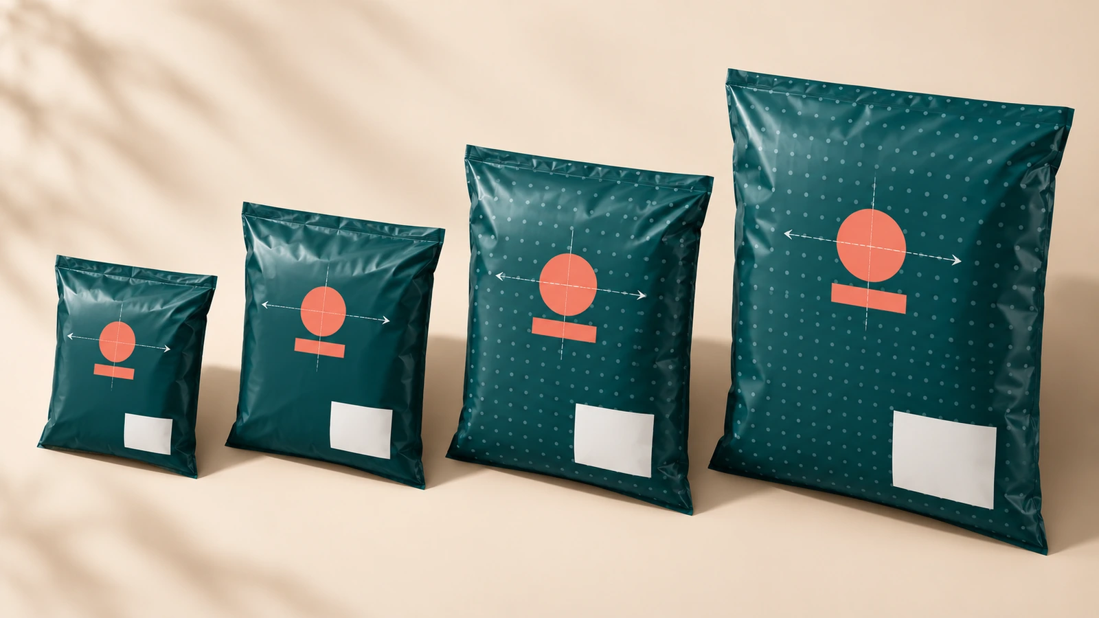
Brands rarely ship in a single size, and the trend is toward more sizes, not fewer. Packaging Dive reported in May 2026 that mailer suppliers are investing in innovations that enable rightsizing or easy consumer product returns[10]. Rightsizing means a family of mailers. If each size is designed separately, the brand looks slightly different on every order. A range system prevents this by fixing a small set of rules and letting everything else scale.
Rule
What to fix
What may change by size
Anchor point
The logo's position relative to the top edge and the center line, expressed as a proportion of the panel
Absolute distance in inches or millimeters
Logo scale
Logo width as a share of panel width, within a minimum and maximum
Absolute logo size; very small bags use a simplified mark
Clear space
A margin defined by a part of the mark, for example the height of one element
Nothing; it scales with the logo
Label panel
Position and minimum size, based on the largest carrier label you use
Extra space on larger bags
Color logic
Logo ink stays constant across the range
Film color can code product lines, seasons or return mailers
Pattern
Repeat size stays constant
The pattern extends to fill larger panels instead of being stretched
Keeping the logo ink constant while varying the film color is the most useful rule for personalised poly mailers across product lines. A brand can run one film color for core products and another for a limited drop or a subscription tier, and customers still recognize the package instantly because the mark and its position never move. It also keeps plate changes to a minimum when you add a size.
Test the system at both extremes. The smallest bag shows whether the simplified mark is still legible. The largest bag shows whether the mark looks lost or whether the repeat pattern needs a larger scale. If both ends pass a doorstep check, the sizes in between will almost always pass too.
FAQ
FAQ: Where should the logo go so the shipping label doesn't cover it?
Reserve a flat, light, unprinted label panel first, usually in the lower half or lower-right of the front, and place the logo in the upper half. Tell your packing team which zone is the label zone. A clean panel also makes paper labels easier to remove completely, which How2Recycle requires before a plastic mailer can enter the Store Drop-off stream.
FAQ: How big should a logo be on a poly mailer?
As a starting point, let the primary mark span roughly 40–60% of the front panel width on your most common size. Then check it on a printed proof laid on the floor and viewed from standing height. If you cannot identify it from that distance, enlarge it or simplify it before adding colors.
FAQ: Is it worth printing on both sides?
Usually, yes. Mailers land face-down in sorting bins and on porches about as often as face-up. A simpler mark or a repeat pattern on the back keeps the package recognizable either way. The back panel is also the right place for secondary messages and any claim block, which keeps the front clean.
FAQ: Which film colors work best with a logo?
Colors that create strong contrast with your main ink and that are opaque enough to hide the contents. Pale and pastel films often need an opaque inner layer. Dark films may need a white underlay for light inks. Check contrast in greyscale and request quotes for each film and ink combination before you commit.
FAQ: Can one design work across all mailer sizes?
One system can, but one fixed piece of artwork usually cannot. Fix the anchor point, the logo-to-width proportion, the clear space and the label panel, and let absolute sizes scale. Use a simplified mark on the smallest bags, and extend repeat patterns on larger bags instead of stretching them.
FAQ: Can I put a recycling symbol next to my logo?
Keep it out of the logo lockup. Store Drop-off labels no longer use chasing arrows, and California's SB 343 restricts recyclability symbols on packaging manufactured from October 4, 2026. Put any claim in a separate block on the back panel so it can be updated without redrawing the brand artwork. The wording itself is covered on our product page.
FAQ: Does inside printing make sense for custom branded mailers?
It makes the most sense for brands that rely on unboxing content and social sharing, because the opened bag stays on-brand in close-up photos. It requires an additional print pass, so compare the quote against the alternative of a stronger exterior pattern.
Key Takeaways
Design for a second trip, not just one. — 19.3% of online sales are expected to be returned in 2025 (Source)
Every customer-facing touchpoint, including returns, affects loyalty. — 71% of shoppers are less likely to buy again after a poor experience (Source)
Returns are expensive, so packaging should reduce confusion rather than add to it. — An average return is estimated to cost about 60% of the item's cost (Source)
A clean label panel protects both the logo and recyclability. — Plastic mailers qualify for Store Drop-off only when the paper label is fully removed (Source)
Keep claims out of the logo lockup. — California's SB 343 compliance date of October 4, 2026 applies to recyclability symbols (Source)
Don't print "reusable means greener" slogans. — A centrally collected returnable mailer scored worse in 9 of 10 impact categories even at 40 trips (Source)
Conclusion: Build the Brand System, Then Specify the Mailer
Recognizable custom poly mailers with logo come from a few decisions made in the right order: zones first, then a mark sized for the doorstep, then film and ink chosen together for contrast and opacity, and finally a range system that keeps the anchor point fixed across every size. With that system in place, adding a size, a seasonal film color or a return mailer becomes a production task rather than a redesign.
When your layout is ready, the next step is turning it into a production specification. That covers the return seal, the instruction layout, the artwork checks and sample approval. Our page on custom returnable poly mailers walks through each of those steps. Send us your artwork and range plan for a quote on sizes, film colors and print options.
Footnotes
National Retail Federation and Happy Returns, "Consumers Expected to Return Nearly $850 Billion in Merchandise in 2025," press release, October 15, 2025. Figures cited: 19.3% online return rate, 15.8% overall return rate, 82% free-returns consideration, 71% less likely to repurchase after a poor experience; quote by Katherine Cullen. nrf.com↩
Retail TouchPoints, "NRF Forecasts Nearly $850 Billion in Returns in 2025," October 15, 2025. Sample: 2,006 consumers with at least one online return in the past year; 358 US retailers with annual revenue above $500 million. retailtouchpoints.com↩
Investopedia, "What Really Happens When You Make a Return?", December 6, 2025, citing Simone Peinkofer, Michigan State University. investopedia.com↩
How2Recycle, Frequently Asked Questions, "Can I recycle plastic mailers?", accessed October 2026. how2recycle.info↩
National Retail Federation, "2025 Retail Returns Landscape," research page, October 2025. Figure cited: approximately 9% of returns are fraudulent. nrf.com↩
How2Recycle, "Store Drop-off: US Only," accessed October 2026. how2recycle.info↩
GreenBlue, "How2Recycle Unveils New Design for Store Drop-off Label," April 23, 2025. greenblue.org↩
Waste Dive, coverage of How2Recycle recyclability labels and California SB 343, October 1, 2026. Also reports that about 71% of the US population lives within 3 miles of a polyethylene film drop-off point. wastedive.com↩
Park et al., Journal of Industrial Ecology, 2024, DOI 10.1111/jiec.13537. Canadian apparel e-commerce case study comparing returnable and single-use mailers. doi.org↩
Packaging Dive, e-commerce envelope and mailer innovation report, May 21, 2026. packagingdive.com↩
Hi there! I'm Bruce, proud dad to my amazing son. I'm the founder of Zigpac, a printing and packaging company empowering small and medium-sized businesses with custom solutions. Let's create something great together!



 Blog PDF for offline reading






The information below is required for social login
Sign In
Create New Account