We use cookies to enable our websites to remember information, to help some website functionalities to work properly, to understand how you interact with and use our websites and to display you content and ads that are relevant and engaging for you.
By clicking Accept All you consent to the use of these cookie.
The store will not work correctly when cookies are disabled.
Quick answer: A strong personal journal cover for a corporate gift pairs one element that belongs to the recipient, such as a name or initials, with one element that marks the brand or occasion, such as a small logo, event motif or short quote. It then uses only detail the cover material can reproduce: single-tone line work for engraved wood, subtle tonal marks for debossed leather-style covers, and full color only on printed paper or fabric.
Journals are among the few corporate gifts people keep using. In ASI's 2026 study of US consumers, 75% of people who received a promotional notebook used it at least once a week[1]. 61% kept it for at least a year, and ASI estimates roughly 500 impressions over a notebook's life. The recipient will look at whatever you put on the personal journal cover hundreds of times, so the cover deserves the same care as the gift budget.
Cover designs tend to fail in three ways. The first is a logo enlarged across the whole front, which makes a thoughtful gift read as conference swag that belongs in a drawer. The second is a cover that is too precious to use. One stationery reviewer observed that a wood-veneer pocket notebook looked so much like real wood[2] that many owners left it on the desk instead of carrying it. The third is artwork that ignores the material. A family-style photo engraved into dark wood, or a five-color logo sent to a single-tone engraving process, arrives muddy or incomplete, and engraving cannot be undone.
This guide gives corporate buyers a practical framework. It covers the three layers of a cover, the five kinds of content you can put on one, how each fits different cover materials and gifting occasions, and the wording that should never appear on a cover. It is about design decisions, not production specifications.
What makes a personal journal cover different from a branded notebook?
A branded notebook is built around the giver: the logo is the message, and every unit is identical. A personal journal cover is built around the receiver. At least one element on it is specific to that person or to a moment they shared with your organization. This distinction matters more than ever in promotional buying. PPAI research found that customization and eco-friendly products are set to dominate new promotional offerings[3], and about two-thirds of leading distributors and suppliers reported rising buyer interest in eco products.
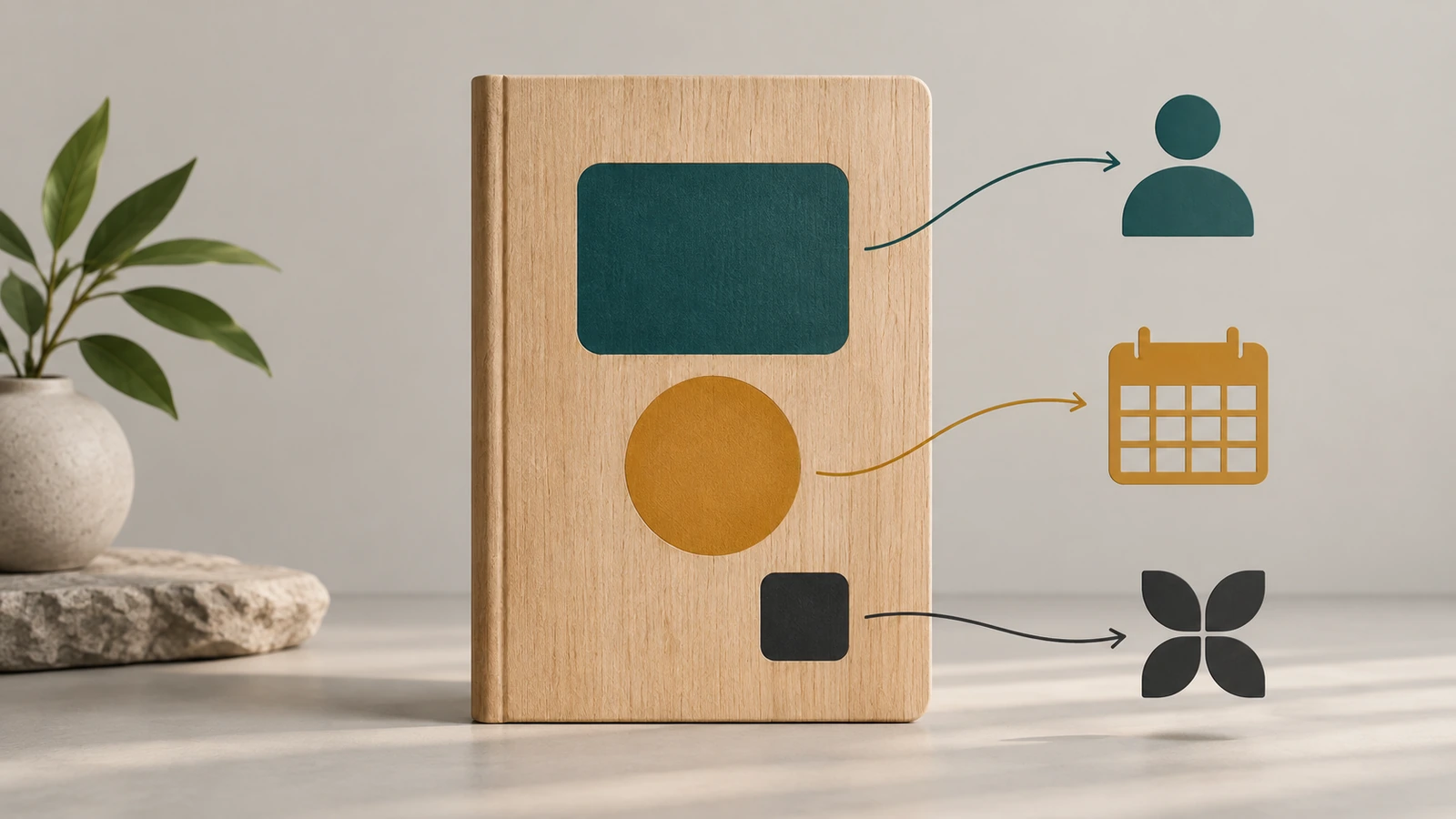
It helps to think of any cover as having three layers.
Identity layer: the recipient's name, initials, monogram or a role they earned.
Context layer: the reason for the gift, such as an event motif, a milestone, a team emblem, a value or a short quote.
Brand layer: your logo or brand mark.
The working rule is to choose two layers and let one lead. Name plus small logo suits client thank-you gifts. Event motif plus small logo suits conference delegates. Name plus milestone suits retirements and anniversaries. Using all three at equal size produces a crowded cover where nothing reads first. Personalized notebooks that feel premium almost always leave generous empty space around one clear focal point.
How to design a personal journal cover in six decisions
1. Start with the occasion, not the artwork
First decide what the recipient should remember when they pick the journal up a year later. An onboarding journal should make a new hire feel they belong, so a team emblem or company value works better than the corporate logo. A client gift should make the client feel recognized, so their name leads and your brand steps back. A retirement or long-service gift commemorates a person, so it can carry dates and achievements that would look odd on an everyday gift. Writing this intent down in one sentence settles most later arguments about logo size.
2. Choose the hero element
Each of the five common cover elements has a typical strength and a typical trap.
Recipient names and initials. A name is the fastest way to turn a stock gift into a journal custom-made for one person. Use the name people actually go by, taken from a checked list rather than typed from memory, and flag accents, hyphens and non-Latin characters before artwork is built. Avoid job titles on gifts meant to last, because titles change while engraving does not. Initials or a two-letter monogram look more discreet than a full name and suit senior recipients and clients. When every unit carries a different name, each cover becomes a separate approval item, so build that review step into your schedule.
Logos. Supply a single-color version of the logo, because most cover processes reproduce one tone. Keep it secondary on gifts for individuals: lower corner, back cover or spine. Drop taglines and fine legal marks, since small type fills in or disappears on textured materials. A symbol-only version of the logo often looks better than the full wordmark.
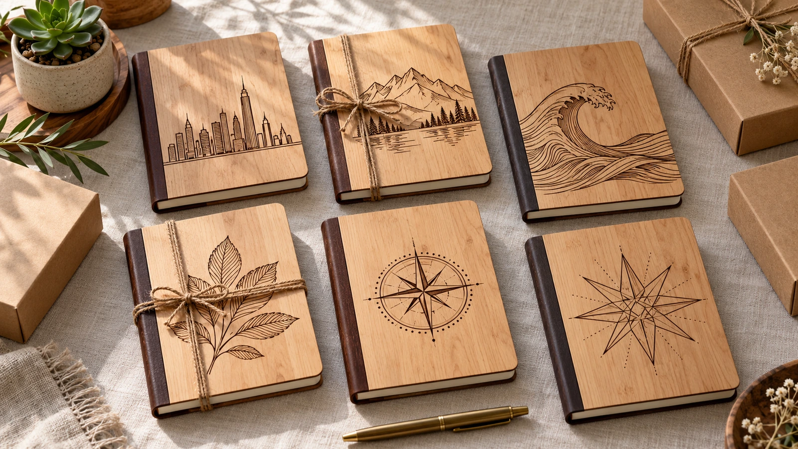
Event themes. Build the motif from something attendees experienced, such as a city's skyline, a river line, a mountain profile or a pattern drawn from the venue's architecture. Event journals outlive the event, so keep the year small or put it on the back. That way the cover still feels like a keepsake and not an expired badge.
Quotes and company values. A short line works best: one value word or a phrase of a few words. Lines from songs, recent books and films are usually protected by copyright and may need permission. Company-authored values or public-domain sources are safer. If the quote is long, move it to the inside cover and keep the front quiet.
Artwork and illustration. Line art, botanical drawings and geometric patterns reproduce cleanly on most materials. If you commission an illustrator, secure written rights for the use you plan, including reorders. Be cautious with AI-generated imagery for client gifts. Some recipients object to it, and the rights position is less settled than for commissioned work. Photographs need continuous tones, so keep them for printed covers.
3. Match the element to the cover material
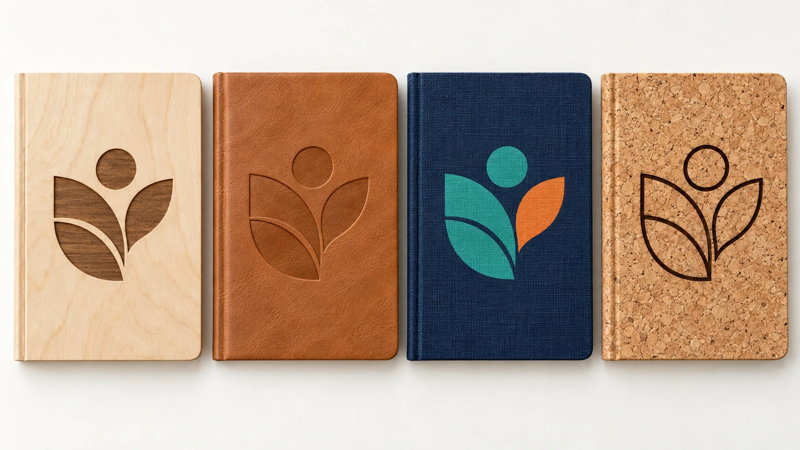
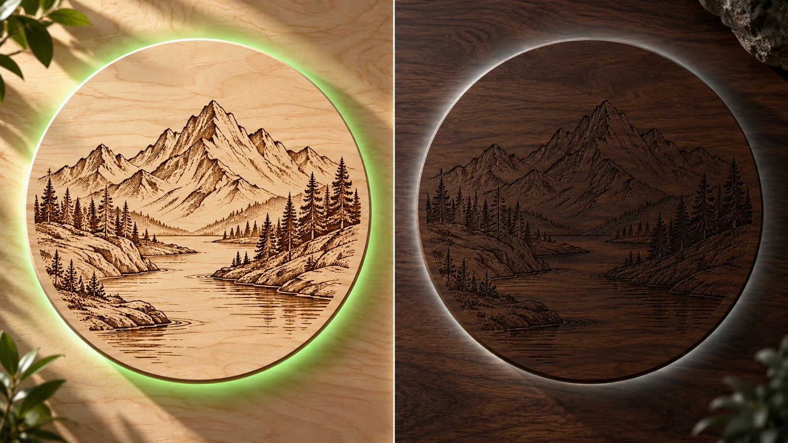
Laser-engraved wood and plywood produce a single burned tone whose contrast depends on the wood. Pale faces such as birch or maple show crisp dark lines, while darker woods such as walnut give a subtle, low-contrast mark. Grain also varies from cover to cover, so present that variation to recipients as character, not as a defect. Debossed leather-style covers give a tonal, recessed mark that looks premium but hides thin lines. Printed paper, fabric and cloth covers are the only route for full-color logos and photographs. Cork rewards bold, simple shapes and loses fine detail. If you settle on wood, our page on custom wooden notebooks with laser-engraved plywood covers covers construction, sizing, surface options and engraving file preparation, so this guide does not repeat them.
4. Set hierarchy and placement
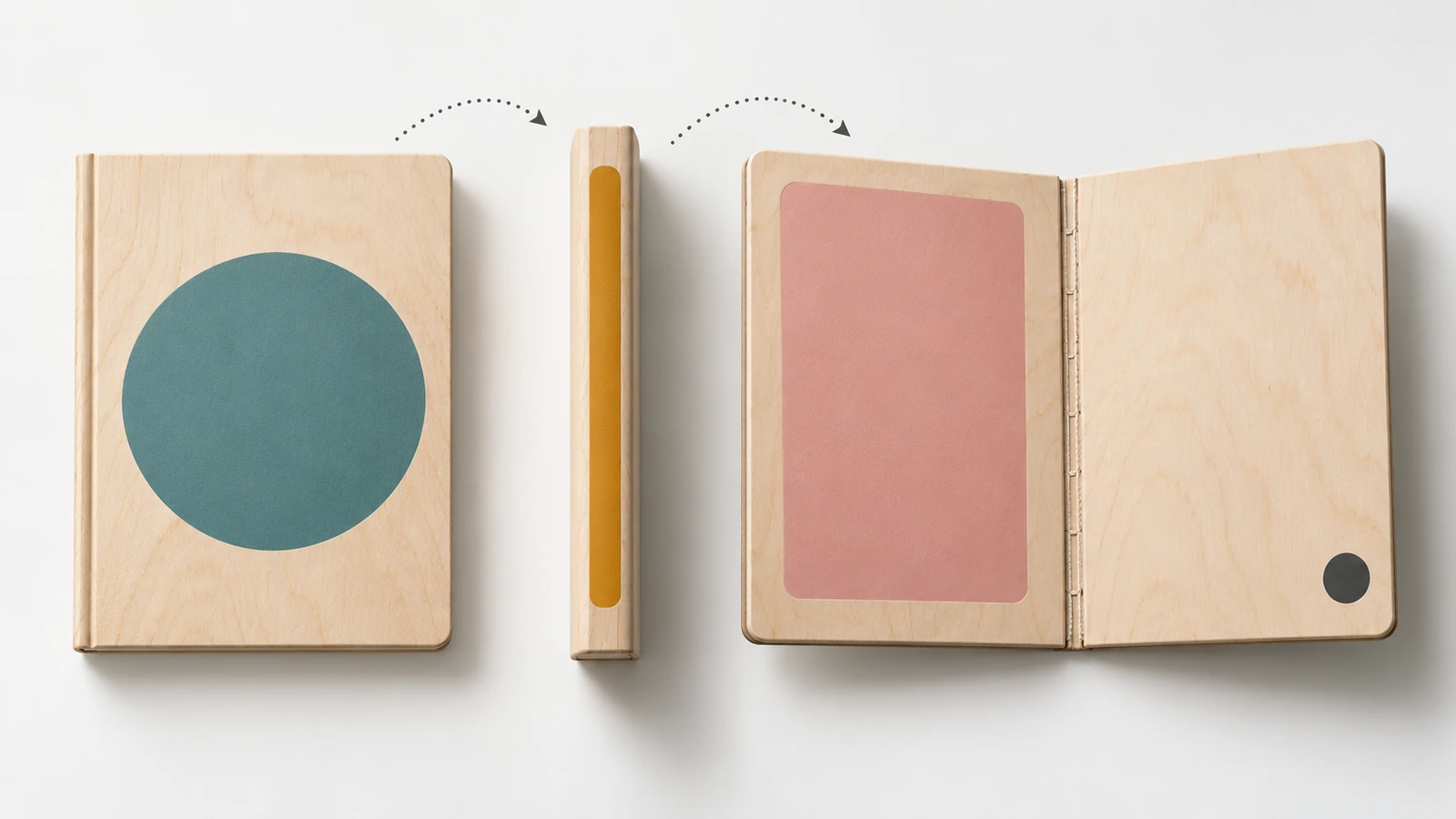
Treat the front, spine, back and inside cover as four separate spaces. The front carries the hero element only. The spine works for a small logo or a single initial that shows when the journal stands on a shelf. The back suits the brand mark, an event date or a discreet program name. The inside cover is the right place for a personal message from a manager, a longer quote or a dedication. Moving supporting elements off the front is the quickest way to make a cover look intentional instead of busy.
5. Keep unverified green claims off the cover
Sustainability is a strong reason to choose natural materials. Sustainable products made up 13.77% of US promotional product sales in 2024[4], up about 20% year on year. That popularity tempts teams to engrave slogans like "eco-friendly" onto the cover. The FTC's Green Guides advise marketers not to make broad, unqualified claims such as "green" or "eco-friendly"[5]. An unqualified "recyclable" claim requires recycling access for a substantial majority, 60%, of consumers or communities. The Guides also warn that an unqualified "made with renewable materials" claim[6] may imply recycled content, recyclability and biodegradability, and they use bamboo as the example.
The same caution applies to certification marks. FSC labels depend on an unbroken certified chain of custody, and the chain-of-custody standard is under revision[7], with current rules still in force while comments are analyzed. In 2026, FSC and ASI launched transaction verification after finding unlicensed FSC promotion and misleading "100% bamboo" claims[8]. Those findings concerned household paper, but the lesson carries over. A cover is permanent and public, so keep claims and logos off it unless your supplier's documents support the exact wording. The documentation itself is covered on the product page.
6. Design for how the journal will age and be used
An engraved or debossed cover lasts as long as the journal does, so avoid content that will date badly, such as campaign slogans, interim team names or this quarter's targets. Natural materials also respond to their surroundings. Oregon State University Extension notes that wood for heated indoor environments is typically dried to about 7% moisture content[9]. That is one reason a wooden cover gifted in a dry winter office may behave differently from one sitting in a humid warehouse. Finally, encourage people to write in the journal. A short note on the inside cover inviting use helps counter the "too nice to write in" effect. So does matching the paper to how people will write. One independent review of a wood-covered journal found no show-through with everyday pens, but the paper cockled under wet media[10].
Matching cover ideas to materials and occasions
The first table shows how each cover element performs on the four common cover materials. The second maps typical corporate occasions to a cover combination.
Cover element
Laser-engraved wood or plywood
Debossed leather-style
Printed paper or fabric
Cork
Name or initials
Excellent; crisp on pale faces
Excellent; discreet, tonal
Good; color can match brand
Good with bold, simple type
Single-color logo
Excellent as a symbol mark
Good; thin strokes may close up
Excellent
Fair; fine detail is lost
Full-color logo
Poor; colors become one tone
Poor
Excellent
Poor
Event motif or line art
Excellent; grain adds depth
Fair; simplify the drawing
Excellent
Fair; use outline shapes
Short quote or value
Good when kept brief
Good
Good
Fair
Photograph
Poor on dark woods; risky overall
Not suitable
Excellent
Not suitable
Occasion
Hero element
Supporting element
Best-fit cover
Avoid
Client thank-you
Client's name or initials
Small logo on back
Engraved wood or debossed
Large front logo
New-hire onboarding
Team emblem or company value
First name inside cover
Engraved wood or printed fabric
Job titles
Conference or offsite
Location-inspired motif
Small year on back
Engraved wood or printed
Full agenda or sponsor lists
Retirement or long service
Name with milestone
Manager's message inside
Engraved wood
Generic stock artwork
Leadership or board gift
Initials or monogram
Logo on spine
Debossed or dark-wood engraving
Bright colors, slogans
Employee recognition
Name with award theme
Value word
Engraved wood or printed
Vague praise phrases
Frequently asked questions
FAQ: Should the company logo go on the front of a personal journal cover?
For gifts aimed at individuals, usually not at full size. Put the recipient's name or the occasion motif on the front, and place a single-color logo on the back, spine or lower corner. Event journals for large groups are the exception, because a theme-led front with a small logo still reads as a keepsake.
FAQ: Can every journal in one order carry a different name?
Variable names are common in personalized notebooks, but each one becomes a separate item to proof. Send a verified spreadsheet with preferred names, check special characters early, and ask your supplier how they handle name lists and approvals. Our team can confirm options when you request a quote.
FAQ: Will a full-color logo work on a wooden cover?
Not through laser engraving, which produces a single burned tone. Ask your designer for a one-color or outline version of the logo. If brand colors are essential, choose a printed paper or fabric cover, or move the colored logo to an insert or the packaging.
FAQ: Can we print "eco-friendly" or an FSC logo on the cover?
Avoid unqualified environmental slogans. FTC guidance treats them as hard to substantiate. Use a certification mark only when your supplier's certified chain of custody covers that exact product and claim. Plain material descriptions placed inside the cover or on packaging are safer than slogans on the front.
FAQ: Do journals for school or youth programs need anything extra?
Yes. If a journal is designed or intended mainly for children 12 and under, US rules cap accessible parts at 100 ppm total lead[11]. Untreated wood and paper are exempt from third-party lead testing, but not from the limit itself, and coatings or inks need separate review. Tell your supplier the audience before you finalize the design.
FAQ: Is a photo a good idea for a corporate gift cover?
Only on printed covers, and only when you have permission from everyone in the image. Engraving reduces photos to one tone, and detail is often lost on dark or strongly grained wood. For engraved covers, convert the idea into line art instead, such as a building outline or a simplified team illustration.
Key takeaways
Notebooks get used, so the cover is seen often. — 75% of recipients used a promotional notebook at least weekly (Source)
Cover content should stay relevant for a year or more. — 61% kept a promotional notebook at least a year (Source)
Demand for sustainable gifts is real, which raises the stakes on accurate cover claims. — 13.77% of 2024 US promo sales were sustainable products (Source)
"Recyclable" on a cover needs evidence of broad recycling access. — 60% of consumers or communities is the FTC benchmark for an unqualified claim (Source)
Wooden covers respond to indoor conditions. — about 7% moisture content is typical for wood used in heated interiors (Source)
Youth programs bring a separate compliance limit. — 100 ppm total lead applies to children's products (Source)
Turning cover ideas into a gift people keep
The covers that work are rarely the busiest. They pick one person-centered element and support it with one quiet reference to the brand or occasion. They also choose artwork the material can render faithfully and leave out anything that will date or overclaim. Settle the occasion first, then the hero element, then the material, and placement mostly follows.
If engraved wood suits your program, see our custom wooden notebooks page for plywood construction, sizing, file preparation and the sampling route to production. Then send us your recipient list and cover concept for a quotation tailored to your quantities and timeline.
Hi there! I'm Bruce, proud dad to my amazing son. I'm the founder of Zigpac, a printing and packaging company empowering small and medium-sized businesses with custom solutions. Let's create something great together!



 Blog PDF for offline reading






The information below is required for social login
Sign In
Create New Account